Semi Permanent day 2

The First speaker of the day was Kyle McDonald, I picked up on a few key points that I found particularly interesting.

When is human Authorship essential?
What features of humanity do we want to automate?
He likes misusing technology to change the way we think about them.

The second speaker was Carolien Niebling
Her talk was about her book about the sausage. She said the sausage is the ultimate design object because it has lasted for over 5000 years and remained very much the same. When something is good, it lasts.
Eximus Forivore (Supermarket eaters)
Omnivores (Meat and Vegetable eaters)
She introduced us to an interesting new concept called the psychology of disgust.
Playing with the senses is a beautiful thing.

The next speaker was Shantel Martin
If you have time at all you have time to pause.
Create your own opportunities with what you have access to.
When collaborating, find the treasure in everyone.
Don’t play the if game (if I had this then I could…)
Let young people create what they want
Artists always struggle

The next speaker was Erik Brandt
Eriks talk was amazing but he didn’t say much that I felt like I needed to write down. He narrated the story of his book, Ficciones Typografica, which is the story of the wall of his shed that he posted over 1600 posters onto.
Although he said if you can make Papyrus look good then you’re in a very good place as a graphic designer.

Then we had RARE, which wasn’t really design related.

Ralph Groene was the next speaker and I really enjoyed this talk aswell.
Designing products is like designing a dialogue between the designer and the user.
Design can also be manipulative.
He believed that the physical world will soon have its Renaissance.
Design Culture, not design language.
“You have more bad ideas than good ones, embrace failure.
The digital space is so new and still has so much space to explore.
Starting with glass produces different results than if you started with wood.

Jesper Kouthoofd, the last speaker of the day was from a company called Teenage engineering. Before this talk I thought that a name like teenage engineering meant that the presenter was going to be a teenager but in actual fact the presenter said that they’re called teenage engineering because they do things without giving them any thought, like teenagers. I thought this was hilarious.
Teenage Engineering are firm believers in tactility. They didn’t want their high end synthesizers to be digital, or touch so they added leavers and cranks to their devices to allow for artistic expression.
Jesper’s interest was in connecting the passive music listening experience to an active participation. As a hybrid.
Good design should be memorable. You should be able to draw a product from memory after your first glance at it.
“Don’t limit yourself, learn new softwares all the time”
His company sticks to only a few colours that they chose from the original RAL colour system.

They were inspired by Bauhaus colour geometry, A triangle is Yellow, A square is red and a circle is blue.
Another great idea was his concept of silent approval. This was a form of validation as to whether or not a product was worth working on. They would put all of their prototypes out on the table to show their clients and without saying anything would encourage the clients to inspect. If a product didn’t get picked up it wouldn’t get worked on.

Semi Permanent day 1

Future of the future was the first day. The speakers were, Ivy Ross from Google, Charles Adler from Kickstarter, Bruce Mau From Massive Change Network, Ana Arriola from Microsoft and Carla Cammilla Hjort from Space 10.

Ivy Ross: Spoke about what it means to hold Google in your hand and her project she exhibited at the Milan Design Fair.

Charles Andler: Spoke about how he started up Kickstarter but one of my favourite things he said was.
“New Technologies require new behaviours. When the car was invented there were many accidents and so we needed traffic lights, licenses and an entirely new education system that dictated whether or not you were allowed to be on the road. ”
This reminded me of ride sharing, how it’s in its infancy.

Bruce Mau: Reassuringly said we need to make products that last. He explained that his students were taken into a forrest with native elders and were shown how to build a canoe. They would search the forrest until they found an old birch tree that was ready to die. When a birch tree reaches the end of its life it sheds its bark and it peels off easily. The elders say the tree gives up its bark. So the students are shown how to turn the bark into a beautiful canoe. When the natives no longer need the canoe it simply degrades and goes back in to the earth. Bruce explains that it is this ecological kind of thinking that we need to adopt if the human race is to continue.

“People who designed the concept of trash and planned obsolescence are the worst super-villains in history”
He also told a very interesting story of the 111 navy chair.

When asked to design redesign the Muslim Mecca for the next 20 years to allow for furture technology and population growth. He explained that in 20 years time we will likely still have cars so thinking that far in the future won’t be as big of a change as is required. He stated that in order for the system to be designed properly he’ll need to design the festival for 1000 years in the future. This way the design outcome will be a flexible system that allows for technological and population change. It’s a new way of thinking.

Ana Arriola: Decolonosing desing

Carla C. Hjort: She told me about a philosopher called Nietzsche

Ideation Workshop 1

Yesterday I set up a very impromptu workshop ideation session with a friend named Jacob. It started with the two of us and we had a bunch of A5 pieces of paper. We gave ourselves 2 minutes to come up with an idea for “How can we get people to care about Onzo’s more?”. Here were our two ideas…

The ideation exercise was designed to let the ideas we came up with go through many iterations in a short amount of time. We then had to come up with another idea based off of the other persons idea.

By this time we were growing in numbers. Taking up an open space was working to our advantage. We had Ester, Briar and Rowena join us and then Liam and Kane. The space came an organic one in that people were able to tag in or tag out whenever they felt like it. Anyone was welcome but no one was pressured in to working with us.

The group came up with many ideas for me and I felt the exercise extremely beneficial.
We then decided to go around in the circle and ideate for everyone else’s projects.

Designing to prevent Vandalism

I think the word vandalism needs some exploration and to better refine what I’m trying to achieve.

Vandalism: action involving deliberate destruction of damage to public or private property.

This isn’t really the correct word to use because I think someone who is looking to damage things is going to do just that. Damage is their intention and there isn’t much in the way a designer can do for that. For this reason I think the words Misuse or Mistreat serve the purpose of my project.

Misuse: use (something) in the wrong way or for the wrong purpose.

This word caters for my end user better than vandalism. These words more-so imply that the person isn’t intentionally causing damage. They are however, causing damage or strain on the object by using it incorrectly, (misusing it). This isn’t really something that has been a problem in design up until now because design was always focussed on selling a product. As soon as someone had purchased the product and was satisfied with it, it was no longer the designers problem. The user could do whatever they wanted with it. They could misuse it until their hearts content. But when we design for product service systems, we want products to last as long as possible so it is essential that the user uses the product correctly to ensure that it maintains its quality.

I believe there are two ways that design can attempt to counter mistreatment of a product. There is defensive design and then there is behavioural design. I went into depth on defensive design earlier in this blog but I think it is important for me to reaffirm my stance on the concept. I think it is discriminatory and unethical. The act of putting up a barrier to say no you can’t use this is quite aggressive and not what I would consider good design. A much more subtle way of achieving a similar thing is what I have decided to call behavioural design (still not certain on the name but it’s a work in progress). This is where the object subtly implies how it doesn’t want to be used through its form, colour, typeface, location, texture, and tone etc… It’s non evasive and has a sense of vulnerability that tells the user that this is something that needs to be used with care and respect. I call this behavioural design because the designer is trying to imply a certain behaviour in the user.

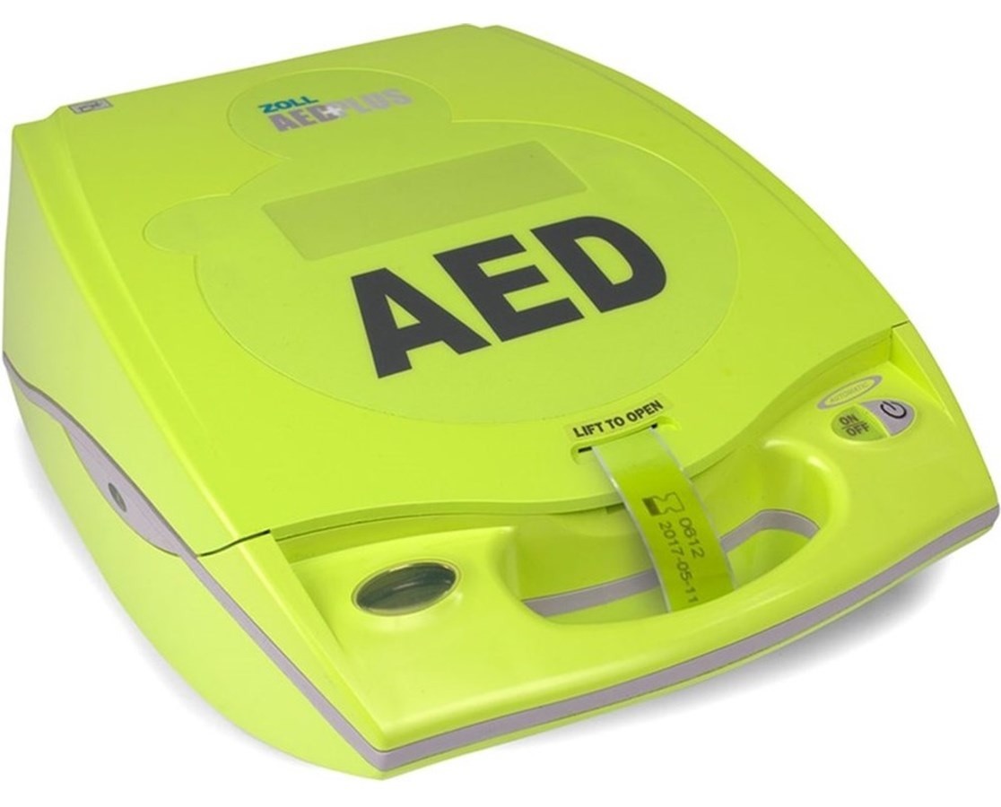
A change of Plan… Defibrillators

Karl has suggested that I change tac. Wellington is trying to bring in more defibrillators into the city to improve the overall safety of people when not near a hospital. Enough money has been raised for 2 of these but unfortunately one of them has already been stolen. Karls is suggesting that I look to design for care for this device to solve the problems for Onzo. Solving the problems for something as tangible as a green box on the wall will make things much easier to prototype and test for (which is exactly what I want). I don’t know if a defibrillator is right though. Perhaps redesigning the way we do defensive design in cities?

The Second Showing

In the lecture before the second showing I had the strangest prototype that would test to see if people would actually respect a docking system without it being strictly policed.

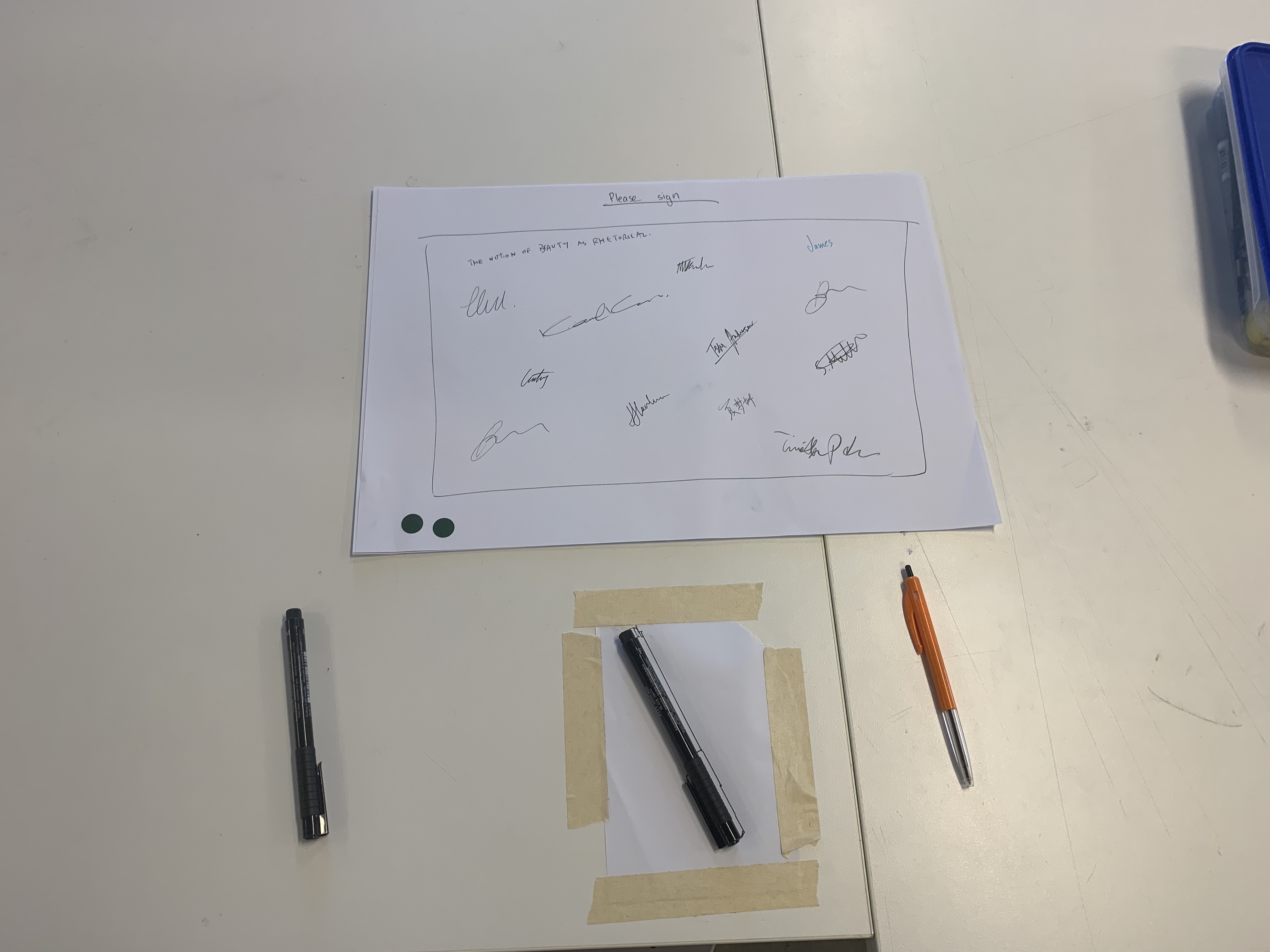
I set out three pens. A cheap BIC pen, and two nice art pens. The BIC and one art pen was ‘dockelss’ and the other art pen had a home/dock. I simply asked participants to write on the piece of paper in front of them. They had the choice of picking up any of the three pens. Interestingly, the most commonly picked up pen was the BIC followed by the dockless art pen. The two dockless pens were never put back in their original position and at one time the BIC pen had been taken all together. As for the docked pen, it wasn’t used until the end of my experiment, when I decided to placed it in a more convenient position. Even then though only one out of the two people to use the docked pen put it back in the dock.

So the comparisons I took from this was that the BIC pen represented a bike that was obviously mass produced and had a lower perceived value in the eyes of the participants than the two art pens. The dockless art pen represented a high end dockless bike and the docked art pen represent a high end docked bike. So when a pen went missing it wasn’t a surprise to me that it was the BIC. It is interesting that so few people used the docked pen and even when they did use it, it was only docked 50% of the time. The dockless pens confirmed my hypothesis that states “the fact you can leave them anywhere means they are left everywhere”. Even though the docked pen was put back correctly only once this is still seen as a victory. The pen was unaccounted for only 50% of the time whereas the dockless pens were unaccounted for 100% of the time.

Going forward I would like to expand this prototype and work on it. It is interesting to see the subtle changes in how people behave psychologically towards objects when they are presented in different way. It could be interesting to see what people would do with different words of encouragement/discouragement, friendly typefaces/aggressive typefaces, warm colours/cold colours ect… Perhaps if the ‘dock’ specifically asked for the pen to be returned to its original spot people would be more inclined to do so. I just want to keep iterating this prototype for now and see what learnings I can take from them.

20 in 20

The 20 in 20 exercise is a rapid ideation exercise I learnt last year. You have 20 minutes and a list of 20 prompts. You are tasked with coming up with an idea for each prompt. The list of prompts I used are as follows:

  1. You only had $10 dollars to make it? (cost)
  2. You had to wear your response? (materiality, performance)
  3. It had to be inside a shipping container? (space)
  4. The whole digital world collapsed and there could be no digital component?
    (materiality)
  5. It needed three different touch-points to communicate the one message?
    (narrative)
  6. The target audience was 5 year olds? (audience)
  7. The primary colour was orange? (semiotics)
  8. Your audience had 1 min to engage with the project? (time)
  9. The project had to be viewed from the sky—what is it? (perspective)
  10. The project could only be used in the dark? (time)
  11. You had $1 million dollars to make it? (cost)
  12. You had to use ten screens? (could be in one place, could be scattered, could be
    hand-held) (materiality)
  13. You were only allowed to use headphones? (audio)
  14. If the response was an interpretative dance, where is the stage? (placement)
  15. The target audience was an elderly widow? (audience)
  16. The project was a sign on the side of the road with three words? (distillation)
  17. The target audience had a full day to engage with the project? (time)
  18. The project was an installation at the waterfront? (placement)
  19. You had to use 100 drinking straws in the response? (do they make something?
    do they bring people together? are they used for drinking or something else?)
  20. It was at Disneyland? (placement)

I don’t think I had any gems but I’m fond of:
1. The $10 dollar knit bomb idea that aims to spruce up an Onzo bike
3. A mobile bike dock on a moveable shipping container
4. No digital component, where the bikes are unlocked with keys which are given to paying subscribers
6. Audience is 5 year olds, I added training wheels to the bikes to evoke care.
11. Budget of 1 million dollars, hubs all around the city and a cycle-way.

Unfortunately I don’t think this is working haha

Haircut

The other day I had a haircut and I got on to the conversation of my fourth year project. I explained that I’m re-design Onzo bikes to encourage users to take better care of them, e.g. discourage vandalism. Funnily enough, the guy cutting my hair admitted that he had once drunkenly assaulted an Onzo bike. Instead of awkardly dismissing this I decided to pry and use this opportunity as research. I asked “why, what happened?”
He said that one time, after a night out drinking he thought he’d try an Onzo, he downloaded the app, paid his sign up fee and unlocked the bike. Unfortunately the app said the bike had unlocked but unfortunately the bike physically hadn’t. This confusion resulted in my hairdresser getting very frustrated with the bike so he decided the best course of action was to kick it. Unfortunately the bike didn’t lock again and charged him for a whole 24 hours of payment. This of course made him more resentful.

I think what I learnt from this was that Onzo really just need to get their infrastructure squeaky clean. Their bikes are poor quality and the app barely works. I think if they simply had a smooth running system then they’d have some happy customers.

Carpark docks

So to attempt to give Onzo bikes a place to go without costing more than enough I wondered how difficult it would be to implement specialised carparks for microtransit vehicles much like how we have carparks for disabled parks and electric cars.

There is already a parking space that does a similar thing here at Massey Wellington.

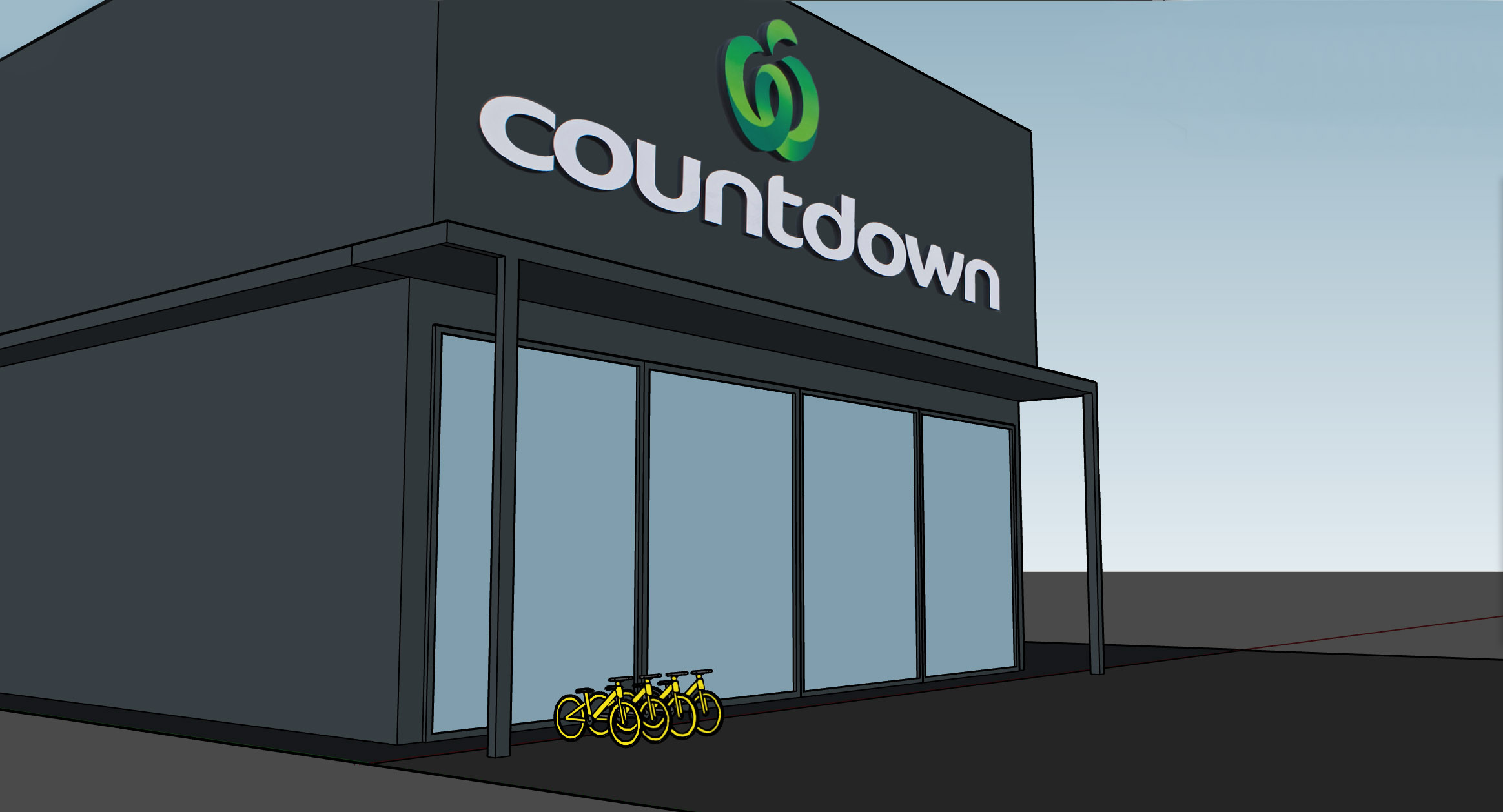
We have many carparks around Wellington and to encourage more car I think places like supermarkets and big parking spaces could easily implement something like this to reduce the clutter of bikes and e-scooters around Wellington.